Color: What Is It And How To Use It In Stop Motion Composition?

The use of color in a stop motion composition is critical in conveying the desired message and creating a powerful visual impact.
Color can be a key factor in setting the mood of a scene, or to highlight an important element in a shot.
Learning how to correctly use color in stop motion can be beneficial for any aspiring filmmaker. In this article, we’ll look into the fundamentals of color and how to use it in stop motion composition.

In this post we'll cover:
Definition of color
Color is one of the most powerful elements of stop motion composition. It consists of hues, tints, shades and values that create a harmonious palette and visual interest when used correctly. Color can also be used to express emotions, create depth and texture in a scene, or provide contrast between objects.
Color is made up of three different components: hue, value, and saturation. Hue is the purest form of color – it includes all colors without added white or black pigments. Value refers to the perceived lightness or darkness of a color – lighter colors have higher values than darker ones. Finally, saturation is the intensity or blandness of a color – highly saturated colors are more vivid than their less saturated counterparts. When combined together these components make up the rainbow spectrum that we see in everyday life!
How color impacts visual composition
Color is an important aspect of successful visual composition in stop motion animation. It has the power to engage the viewer, set the mood and convey meaning. Each color has specific emotional and psychological qualities, so it’s important to understand how color can be used to create a certain atmosphere or tell a story.
The basic concepts of color theory and how it relates to art, design and photography can help you understand how color works in animation. Color theory explains how we can use different hues and shades in combination with each other and with other elements such as line, shape and texture to create a powerful image. The three main principles of color theory — hue, value and chroma — provide essential insight into creating interesting visual compositions.
Hue refers to the dominant wavelength of visible light that determines a particular color’s identity, such as blue or yellow. Value is the degree of lightness or darkness that a particular hue possesses; for example, light blue versus dark blue. Chroma measures the intensity or saturation of a given hue; for example, light pea green versus deep emerald green. By understanding these basic principles of color theory and learning how they can be combined together will help you create effective stop motion animations using strong visual composition techniques.
Color Theory
Color theory is an essential element for creating compelling visual stories. Color can be used to evoke emotion, communicate a message, and establish a mood. It is an important tool for creating a sense of atmosphere and setting a tone. Understanding color theory and how to use it in stop motion composition allows you to create dynamic compositions that will draw your audience in. Let’s take a look at the basics of color theory and how to use it in stop motion composition.
Primary and secondary colors
Stop motion animation relies heavily on color theory and composition to help create the mood and impression of a scene. Within the world of color, there are primary colors and secondary colors. Primary colors cannot be made by mixing other colors together — these are red, blue and yellow. Secondary colors are what you get when you mix two primary colors together — such as orange (red and yellow), green (blue and yellow) or purple (red and blue).
Primary colors each possess certain individual characteristics, like emotions or actions, which can be combined with one another and used in both subtle and bold ways to create a certain feel within stop motion frames. Similarly, when the ratio of mixing primary colors changes, this creates different shades – both light and dark – which also contribute to the overall impression of something within a frame.
Bright saturated hues can be intimidating because they draw all available attention in a frame to one spot while muted pastels can often appear more calming or safe due to their soft nature. Thus it is important to take into consideration both how particular color selections will position your subject relative to other objects in your frame as well as how it will emotionally affect an audience watching that scene unfold before them.
Many stop motion animators make use of complimentary color combinations such as purple/yellow or blue/orange as examples – something good practice for composition that also help tie in multiple objects together visually inside one frame. Color theory is an absolutely essential tool for any aspiring stop motion animator looking to improve their compositions!
Tertiary colors
Tertiary colors are those that are a combination of primary and secondary colors. For example, combining yellow and orange will create the tertiary color of yellow-orange. By combining two primaries you get an analogous color relationship, while combining a primary and secondary will give you a complementary color relationship. Tertiary colors are made up of three different values, hue, chroma, and value. Hue is what makes colors identifiable; it’s a specific combination of wavelengths which reflects from an object’s surface. Chroma is the intensity or saturation of the hue which can be expressed as strong or dull. Value is how light or dark a color may appear; it’s determined by the amount of illumination (and hence the amount of reflected light off an object) coming from the environment’s dominant source of ambient light (the sun). Utilizing tertiary colors allows you to create more vibrant works that are both strong in color yet still aesthetically pleasing due to its use of analogous and complementary relationships working together.
Color wheel
The color wheel is an important tool to help you understand the relationship between colors. It’s usually a circle divided into 12 sections, each with its own color. The three primary colors – red, yellow and blue – are evenly spread throughout the wheel. The other nine sections each contain a secondary, tertiary or intermediate hue.
Each of these hues has its own tone. A hue is a shade or tint of the original primary color made by adding gray, black or white to make the new variation of that color lighter or darker in its tone. For example red+gray=a softer shade of red known as pink or magenta; yellow+black=a darker version called mustard; and blue+white=a lighter variation also known as light blue. In any form, these are all still considered part of yellow, blue and red in color theory because they encompass those same primary colors in one way or another in the mixing process.
To get a better understanding of how different colors look together when used in stop motion composition it’s helpful to study the color wheel generally accepted by artists and designers around the world:
• Primary Color Triad & Opposition – This grouping consists of 3 equal parts-the Primary Red (red), Yellow(yellow) and Blue(blue); plus Secondary Orange (orange), Green(green) & Violet (purple).
• Complementary Colors – Colors that rest directly across from each other on the wheel such as Orange & Blue; Red & Green; Yellow & Purple form complementary pairs when combined together on screen creating strong contrasting visuals due to their vividness and stark difference in appearance against one another.
• Tertiary Hues – Variations made from combining two different primary colors side by side into a single third color such as Blue/Green/Cyan; Red/Orange/Vermillion etc resulting in softer shades known as Tertiary Hues which can be either warm (reds&oranges) or cool (violets&blues).
Color harmony
Color harmony is an important concept in art and design, especially in stop motion composition. It is an arrangement of colors according to a set of rules and principles, resulting in a pleasing and balanced combination. It is based on the idea that certain color combinations create harmony while others create disharmony.
The basic elements of color harmony are hue, value, saturation, temperature, balance, contrast and unity. Hue is the named color such as red or blue; value describes how light or dark the hue appears; saturation indicates how pure or intense the hue appears; temperature refers to whether it appears to be warm (reds) or cool (blues); balance describes whether there is an even distribution of hues throughout a composition; contrast compares intensities between two adjacent hues; and unity refers to how well all elements work together to create a cohesive image.
When considering color harmony for your stop motion composition, it’s important to keep these concepts in mind. Think about the overall effect you want your movie to have — what feeling do you want to convey? Consider also any context clues provided by objects within your scene that can help guide your decisions regarding color palette. Remember that both complementary colors (those opposite each other on the color wheel) and analogous colors (those next to each other) can be used effectively in art works. Experiment with different combinations until you find one that works with your scene!
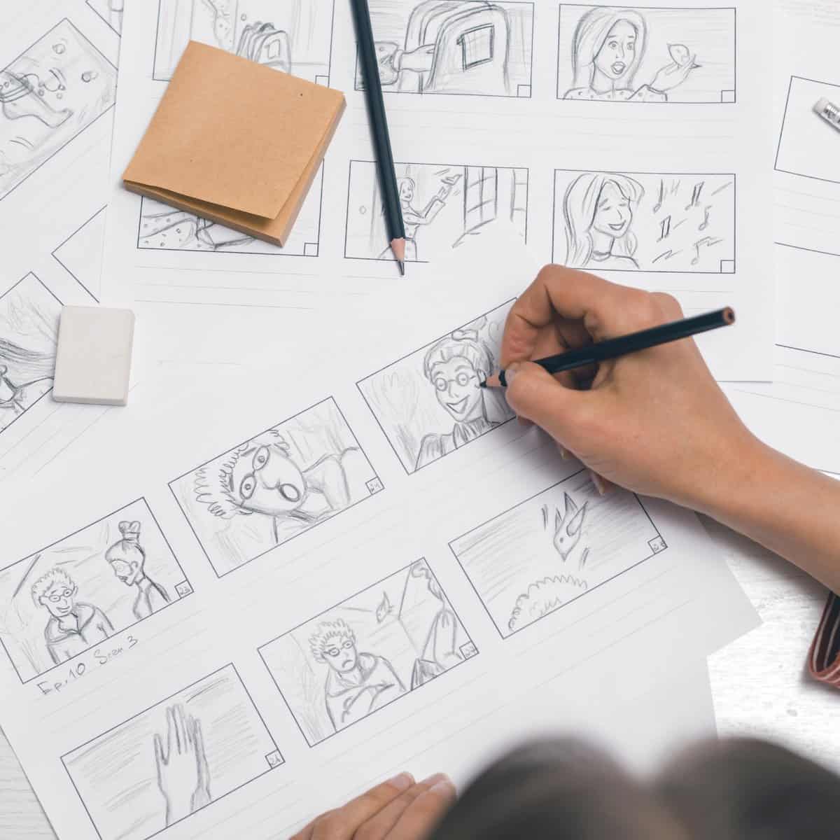
Getting started with your own stop motion storyboards
Subscribe to our newsletter and get your free download with three storyboards. Get started with bringing your stories alive!
We'll only use your email address for our newsletter and respect your privacy
Color Palette
Color is an important part of creating a visually appealing stop motion composition. The right color palette can draw your audience in and create an impactful atmosphere. In this section, we’ll cover how you can use color to your advantage and create an aesthetically pleasing stop motion animation.
Monochromatic color palette
A monochromatic color palette is composed of different hues and shades of the same color. This type of color palette often has a strong visual impact that makes it particularly effective in animation due to its ability to focus the viewer’s attention on specific areas or objects.
It is also helpful when trying to create the illusion of depth in a two-dimensional frame by using lighter tones towards the foreground and darker tones towards the background. A monochromatic color scheme can also be used to create a sense of unity, so that all elements are visually connected.
When creating a monochromatic color scheme, think about how much contrast you want between your shapes, tones, textures and positioning within the composition. This will help make sure your scene looks visually appealing, with pops of interesting textures or lines that stand out from one another.
To achieve this type of palette be sure to choose one main shade as your base (for example, blue) then find several hues and tints that work together in harmony with it (perhaps steel blue and teal). These can then be juxtaposed against each other for greater effect. Try adding some patterns or highlighting certain elements in brighter or darker shades as well — just remember to keep within your predetermined range!
Analogous color palette
An analogous color palette is made up of colors that sit next to each other on the color wheel and creates a naturalistic and harmonious effect. This type of color scheme usually shares a common hue, giving them an overall warm or cool undertone.
Unlike complementary colors, analogous colors do not necessarily have to be split into one warm tone and one cool tone. An analogous palette can even work with just one or two colors. Simply choose colors that sit next to each other on the color wheel. To give your stop motion set more definition, add a neutral color such as black, white or gray either as a background or character colors. Here are some examples of how you can use an analogous color palette in your animation:
-Orange + Yellow–Orange: The natural flow between these two colors combined with the warm undertones creates an inviting vibe
-Green + Blue: These two cooler shades share common overtones but are still able to provide contrast to one another
-Purple + Red: These two warmer shades make for a bold display when used together as they evoke emotions of passion and strength
Complementary color palette
Complementary colors are the colors that are found opposite each other on the color wheel. A complementary color palette consists of two colors that are opposite each other, such as yellow and purple. This type of palette is often used to create harmony or contrast and to evoke a certain emotion. For example, if you want a warm and inviting atmosphere in your stop-motion animation, then you might use a complementary color palette of oranges and blues.
Using a complementary color palette can be quite effective in creating harmonious scenes within your animation. When placed next to one another, complementary colors will bring out the best qualities of one another, intensifying their saturation and creating an energetic yet pleasing aesthetic.
When using this type of color palette for your animation, it’s important to remember that the combination should be balanced. You don’t want one color to overpower the other, or for one side to be too bright or too dark compared with its partner hue. As such, it can help to adjust the hue slightly on either side until everything is in perfect harmony!
Triadic color palette
A triadic color palette is a balance of three colors that are spaced evenly around the color wheel. This type of color scheme creates strong visual contrast while maintaining an aesthetically pleasing harmony between the three hues.
The three colors used in a triadic color palette can be either primary, secondary, or tertiary colors depending on preference and desired effect. In traditional art, primary colors are red, yellow and blue; secondary colors are made by combining two primary colors and include orange, green and purple; tertiary colors make up the remaining hue families and include red-orange, yellow-green, blue-green, blue-purple, red-purple and yellow-orange.
When using a triadic scheme for stop motion composition it is important to think about both boldness as well as ambiance. If you want to create an atmosphere with bright bright contrast then it may be wise to construct a palette of pure primaries such as bright yellow with vivid reds or blues. But if you’d like to establish a more ambient style then try muted hues such as deep blues or burnt oranges that still offer contrast but do not distract from characters or other elements within the scene composition.
Split complementary color palette
Split complementary color palettes consist of three hues, one main color plus the two colors directly adjacent to its complementary. For instance, if your main color is blue, the corresponding split complementary palette will include yellow and green. This type of layout is often used as part of an internal design strategy as it creates visual interest while maintaining a certain stability and harmony. In stop motion composition, using this type of palette can help you create a sense of unity despite using multiple intense hues, which can be difficult to mix.
The primary advantage of the split complementary palette comes from its ability to harmonize multiple intense hues while still creating attractive art. Generally speaking, you won’t need actual complementary pairs when using a split complementary palette. It’s basically three variations on a single color that create visual interest without become overwhelming:
-The primary color: In this case it will be blue.
-The two secondary hues: The split complimentary colors for blue are yellow and green.
-An additional neutral hue such as black or white would help tie all these colors together if needed.
Tetradic color palette
Tetradic color palettes, also sometimes called double complementary, are composed of four colors that create a rectangle-like shape on the color wheel. This shape contains two pairs of complementary colors, each pair separated from one another by an equal amount. A contrast-driven tetrad can be used to maximize and balance contrast throughout your frame. The primaries or secondaries in a basis of a tetradic palette can be used at strong points within the scene, such as areas where characters may be placed or centered on. By using these two sets of hues together they can bring vibrancy while still making sure contrast levels are consistent and balanced.
The colors to build a Tetradic palette will usually include one primary and three secondary colors. In other words, it’s helpful to choose either three analogous colors and one complementary (triadic) color in addition to the primary/secondary split, or two complimentary colors with two choices from each direction around the wheel (analogous).
Examples:
-A split primary/secondary palette comprising yellow/red orange and blue violet/violet
-A triangle which uses red orange along with blue green and blue violet
-A mixed scheme based on yellow green , red violet , red orange , blue violet
Color in Stop Motion
Color is an important component of stop motion composition and can be used to great effect when creating visuals that have a specific mood and atmosphere. Color, when used correctly, can add depth to a shot, creating atmosphere and focus on specific elements, and help tell stories more effectively. In this article, we will discuss the basics of color, how to use it in stop motion, and what tools are available to help you create the best possible effects.
Using color to create contrast
Contrast can be used as a tool to heighten the impact of the story, create a mood, and define space within the frame. A combination of light and dark shades can be used to create emphasis on particular characters or areas in a scene. The same rules apply when using color to create contrast; the intensity, hue, and saturation can be manipulated to emphasize elements in a frame.
Using the color wheel is an effective way to figure out which shades will complement each other. This allows composers to have control over how bright or muted their scenes will be. When creating contrast with color in stop motion animation it is important to remember that too much contrast may prove distracting from what is happening in the frame so it’s important to decide what elements are most important for audience focus. To make these decisions consider considerations such as time of day, location or even season when making choices about what colors will be used.
It’s also important if using multiple colors on one character or object that they are balanced in terms of saturation and brightness levels — this helps prevent visual confusion while still drawing attention where it’s needed most. Another way composers can use color when attempting to achieve contrast is through the coloring mask technique; it allows animators separate control over highlight and shadow, allowing them more precise control over how areas in a scene contrasts with one another visually.
Using color to create balance
Color can be used in stop motion animation to create balanced compositions. By using color blocks and borders, you can enhance the contrast in an image and lead the viewer’s eye to where you want it to go.
To make use of color blocks, choose two or three colors that work well together. Try pairing complementary colors or harmonious shades from the same color family. The key is to ensure that one color does not overpower the other, so contrast should be kept light and balanced across the frame. By having a few dominant colors throughout your set, it will help keep all elements visually linked and create a sense of balance within your composition.
Borders are also useful to maintain balance throughout your animation. By defining elements with frames or lines drawn around them, you are creating a visual order that helps separate objects and keep attention on what matters most within your stop motion scene. Colors will usually bleed along border lines so ensuring they match will help keep every element look connected while still allowing your focal point to stand out uniquely against its surroundings. Aim for contrast but avoid letting one element overpower another by using too many contrasting colors; this will just confuse the viewers when their eyes try to figure out what’s happening in the final image.
Using color to create depth
Color is a powerful designer’s tool used to create composition and emotion in pictures. When properly used, it can add an extra layer of impactful storytelling for stop-motion films.
The most basic and versatile way to use color in stop-motion animation is to control the sense of depth and focus for your audience. A range of colors can be used to signify how an object stands out from its environment in a frame; by selecting light hues for the foreground elements, medium tones for mid-ground elements and dark shades for background objects, you’ll more clearly define depths in the scene. Warmer colors are more likely to pop out while cooler colors fade away into the background.
Different combinations and usages of hues will give animators artistic flexibility when introducing color into picture composition frames. For example, you may opt go with one primary color scheme by choosing soft blue greens for scenery, warmer yellow oranges for characters and high contrast reds & magentas as accent tones within each shot — this intensify the details (or other animated elements) depthed in each scene . Such strategies help bring greater emotion & texture from 2D drawings or simple 3D sculptures within a stop motion production. The possibilities are truly endless!
Using color to create mood
Color plays an important role in the composition of stop motion and is a powerful tool for conveying emotion. Using the right colors in your frame can help establish the mood and bring life to your characters. Before you start adding color, first consider what feelings you want to evoke with your scene; this will help you determine which colors to use.
The use of color theory is a great way to ensure your palette brings the right emotion to each scene. For example, bright, vibrant colors can be used to express positive emotions like joy and excitement, while muted shades connote despair or somberness. Soft pastels work well for scenes that are more calming or dreamy. You can also create contrast with your color choices by juxtaposing cool hues against warmer shades. This technique will draw attention from one area of the frame, allowing you to guide viewers’ eyes through every shot composition.
When using color in stop motion composition, it’s important not only think about how tone affects mood but also about how texture interacts with hue. Light fabric can reflect more light than dark materials which will create significantly different lighting effects when filming. Similarly different surfaces like metal or cloth can provide unique visual effects when illuminated by light that changes color over time (e.g., colored gels). Taking advantage of these subtleties with things like props and sets will allow you to further control every aspect of a scene’s emotional tone as well as its look and feel overall.
Conclusion
In conclusion, color can be a very effective tool in stop motion animation. It can provide a sense of mood, drama and emotion to the work, while also creating visual complexity and interest. Color can be carefully chosen to fit the subject matter, tone or broader story established by the images. By understanding how color works and experimenting with its placement and combinations, animators can create powerful visual stories that are impactful, engaging and clearly understandable for viewers.

Hi, I'm Kim, a mom and a stop-motion enthusiast with a background in media creation and web development. I've got a huge passion for drawing and animation, and now I'm diving headfirst into the stop-motion world. With my blog, I'm sharing my learnings with you guys.